


Conversion optimization should be at the forefront of all marketing strategies. There comes a time when you’ve more or less maximized the amount of traffic you get or how much money you can spend effectively on ads.
Before you get to that point – where CRO is your only option – it’s important to optimize your conversions through strategic UI choices. These don’t take much time to implement but can have an outsized positive impact on your bottom line.
Let’s look at a few of the UI changes you can make and why they’re so powerful.
Progressive form fields
A common piece of advice given to those who own websites is, the more form fields you have, the fewer conversions you’ll get. While this may be true in most cases, there are times when data collection won’t serve its purpose unless you ask for a lot of information.
The added information will allow you to send better messages or qualify prospects for your sales team (if applicable). It can also produce insights that dictate how you create content, build out marketing campaigns, and even the way you interact with customers.
Whenever possible, shorten your forms to just a few fields and gather the rest of the information later. When that’s not feasible, focus on progressive form fields.
Progressive form fields may appear to be short when they’re first interacted with but as more data is filled, more fields appear. This is similar but distinct from multi-step forms.
With the multi-step forms, visitors know immediately that the form has more than a single page because there’s usually a progress maker. They also have to click the next button themselves.
Progressive forms often don’t have a progress bar. As a visitor fills information the form automatically gets longer by requesting more information. There’s a sense of being nearly complete from the visitor even as the form gets longer.
There is a limit to the patience of your visitor. If you add twenty form fields, the user will likely abandon the form before it’s complete. On the other hand, it’s not as useful if there aren’t enough form fields.
It’s recommended that you start with five total form fields. Once you have a baseline for your conversion rate, add one form field until your conversions start to fall.
Single page checkout
There’s a lot of debate about how to design a checkout page. You should take into consideration the type of customer, device screen size, the amount of the order, etc. I won’t get into the nuances here. The simple truth is that you don’t want people to abandon your checkout for something trivial after you’ve spent time getting them there in the first place.
In most situations, a single page checkout is optimal for a number of reasons:
- It’s easier for mobile users to navigate
- All important information is shown on a single page
- There’s little to no room for added requirements like creating an account (this is known to increase cart abandonment)
If you choose to adopt this UI change, there are multiple things to get right. First, all charges associated with the purchase should be on the same page. That includes shipping, tax, any additional fees, etc.
Second, it should ask for the minimum amount of information needed to process the transaction. If you don’t need their home address, don’t ask for it. If creating an account is optional, move it to a screen after the checkout is complete.
It can be tempting to try and gather as much information as possible at this point but try to exercise restraint. The most important thing is securing the sale. On the payment confirmation page, you can add a line that says, in order to serve you better, please fill the following information.
In my experience, people are much more willing to fill out forms after they’ve purchased – not before. You can further enhance the user experience by taking advantage of things like shoppable product images, pre-fill or autofill forms, and offering incentives like free shipping or discounts.
Generous white space
White space, negative space, balance space, etc. is an important part of UI design because it can create harmony, enhance visual hierarchy, and even emphasize (or deemphasize) certain elements on a page.
It’s called white space but it can be any colour and refers to the empty space on a page. This can be the space between two elements like an image or a button or even between words and letters. It’s often overlooked until the rest of the UI has been decided.
This is a mistake. Since it has such big impact on how a page is perceived, it should be among the first things considered – even before you choose your images.
When used correctly, it increases comprehension and gives the design a cohesive feel. If used the wrong way, the page may become crowded and make it harder for your visitors to understand what they should be doing. These days, service brands, software companies, bloggers, etc. are adopting more white space in their designs. In the end, using large amounts of white space encourages you to become picker about what you place on the page. Each element that makes it to the final design is given more weight.
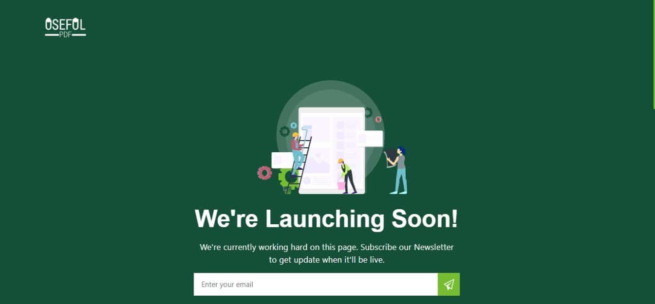
In the example from UsefulPDF above, there’s ample white space and a single image above the fold. It’s clear that the visitor is meant to register – even though the font used is small. When white space is combined with a rich colour palette, it further reinforces the messages you want to deliver to your visitors.
Large Type
Large typography goes hand in hand with using white space. One of the most difficult things in web design is getting people to take your desired action. Part of that difficulty stems from them not understanding what you’d like them to do.
There’s an assumption that the first thing on a page gets seen first but that’s not entirely true. Visitors read pages in an F patter unless they see something that grabs their attention. That’s what large type accomplishes.
Large type, used in conjunction with white space, can help create a clear visual hierarchy and break normal reading patterns of your visitors. Your most important messages get seen in the order you want thus boosting comprehension and, by extension, conversions.
Minimal navigation
Website navigation is one of the most important considerations. It connects different areas of your website and shows visitors the most important pages at a glance.
It can also be abused by adding too many items to the menu. In cases like that the navigation itself loses value because there are too many options.
Today, more and more people are accessing the internet but most of them are on mobile devices which requires different design considerations.
Since mobile devices have trouble scrolling longer menus, it’s essential that the most important information is visible with a click. If not, everything below the fold may be inaccessible to mobile users.
In other words, strip your menu down to the necessities. This may seem counterproductive at first because certain pages become hidden. In reality, it helps you and your visitors.
You’re forced to identify the most important pages and display them prominently. It helps visitors by cutting down on their cognitive load and pointing them in the right direction immediately.
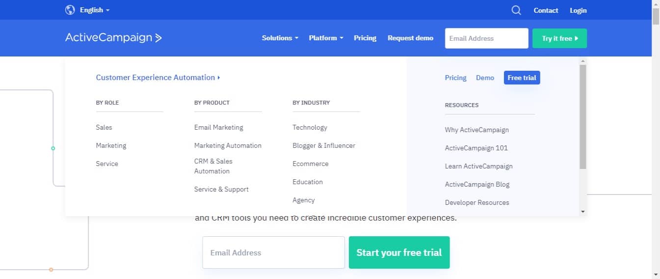
In the example above, ActiveCampaign has multiple navigation options and a new visitor may be confused about which one is most important.
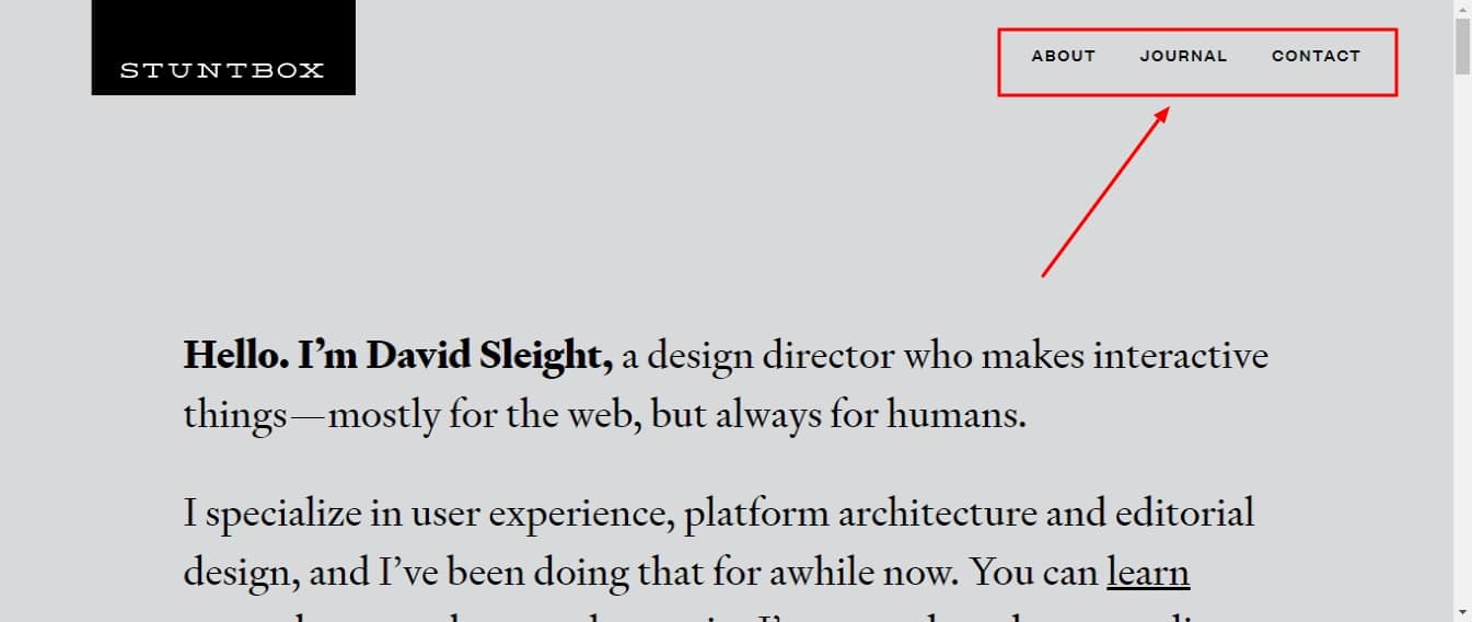
By contrast, Stuntbox has a few menu options. They’re clearly labelled and lead visitors to key pages on the website. Since there are fewer options overall, visitors are more likely to spend additional time on and consider each page displayed.
There’s no specific number of menu items needed to qualify as a minimum. When possible, try keeping it to four or less. In the end, it depends on the kind of website you have and the services you offer.
Conclusion
The UI of a website is the first thing that visitors interact with. If it’s not hitting the mark then everything else you’ve created falls short. This guide has gone through multiple UI changes you can start making today that’ll boost your conversions for a long time to come.
Let me know what UI changes you’ve made that led to a boost in conversions in the comments and don’t forget to share.