


For 2021, Jotun unveils REDISCOVER, a collection of newly developed colours complemented by timeless hues carefully selected from the company’s extensive archives. Designed to be mixed and matched, the 29 shades can be deployed in countless combinations to create 21-century interiors that relax, energise and inspire.
Every year, Jotun introduces a new collection of colours formulated and selected to reflect the mood and ideas of the present moment, but this year is different. When times are uncertain, we find comfort in the familiar, and our homes – more than ever – become our sanctuaries, where we can feel safe, secure and at peace. Lisbeth Larsen, Global Colour Manager at Jotun, and her team have responded to the unpredictability of the times we live in by venturing into the Jotun archives and finding fresh inspiration in the colours of the past.

These last months have given all of us opportunities to reflect on our lives and lifestyles, and to properly appreciate how the choices we make affect ourselves, our homes and the wider world. At the same time, the growing importance of sustainability is calling into question the unthinking pursuit of the new – now making the most of what we have has never been more essential. Jotun’s new Global Colour Card, REDISCOVER, is a response to both these cultural currents.
‘During periods of turmoil, our homes become more important. We long to feel safe and secure. Colour can help us achieve that, by cultivating nurturing atmospheres as our needs change from day to day and room to room. Beautiful, timeless colour combinations can create truly stylish homes and surroundings that both reflects our identity and creates a comforting sense of sanctuary.’– Lisbeth Larsen
Jotun has created colours for nearly 60 years and its library now spans thousands of hues. Traditionally, the annual colour card would showcase Jotun’s newly created tones for the home, but this year, Jotun’s colour card demonstrates how a select group of new colours can be combined with shades developed across the past six decades – timelessly inspiring hues that can be called on to tell new stories in our homes. After all, no matter the colours we choose, the truly considered home never goes out of style.
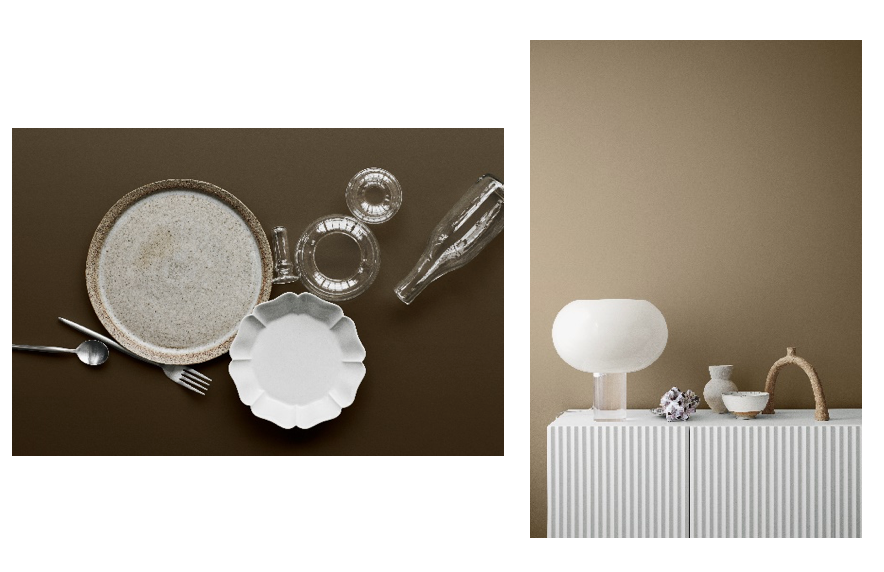
Designed to inspire Jotun customers to create beautiful combinations of their own, the REDISCOVER colour card presents the 29 colours selected or created for 2021 in four palettes – four distinct colour stories – and brings them to life with inspiring imagery by Line Thit Klein, featuring the colours at play in multiple interior settings, styled by Oslo creative studio Kraakvik & D’Orazio.
‘REDISCOVER is our response to the times we live in, and we are excited to present our four colour stories – each one unique, but all offering a sense of stability and a contemporary aesthetic shaped by the fusion of past and present.’ – Lisbeth Larsen
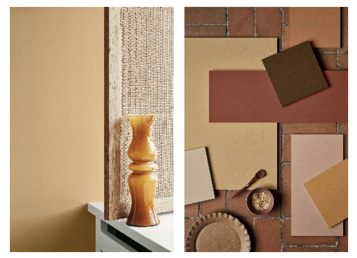
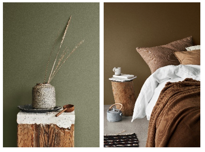
WARM, RUSTIC SHADES
To instil a sense of welcome and comfort
This Earth-inspired palette encourages slow living and sensory appreciation. Whether creating a small, cosy area to relax and daydream or decorating entire spaces, these hues can be deployed in combination to calm busy minds and steady the soul.
New colours
20167 Welcoming Red – rustic and inviting red, full of warmth and wisdom
12120 Desert Pink – restrained and engaging pink, tinged with peach
12127 Earthy Brown – a rich soil-dark shade, deep and honest
12124 Natural Clay – brick-like orange, rustic and authentic
12118 Hummus – yellow and cream in harmony, subtle and refined

Rediscovered colours
10428 Masala – a golden invitation to adventure
1392 Antique Yellow – timelessly elegant with a touch of tradition
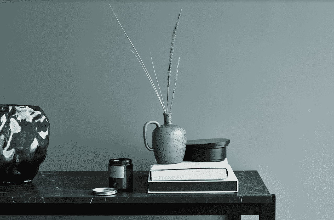
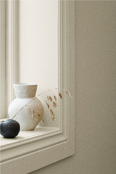
SOFT NEUTRALS AND TACTILE HUES
To simplify the space and clear the mind
In a world of noise and clutter, we are drawn to clarity and peace. We find them by dialling down the volume of our homes, removing the superfluous and celebrating the simple.
New colours
10385 Belgian Brown – quietly sophisticated and full of character
12125 Impression – soulful gilded brown, chic and of the moment
1303 Observe – the colour of calm and clarity
Rediscovered colours
1288 Grand Shadow – tasteful, confident shade with hints of green
1276 Soft – gentle and sheltering golden beige
0486 Early Rain – the cleansing brightness of a golden morning
1563 Lucerne – a delicate balance of muted beige and grey
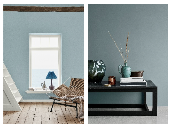
AIRY BLUES AND WEATHERED TONES
to conjure the freedom of sea and sky
These are the colours of wild and far-flung places – the kind we retreat to when we want to immerse ourselves in nature and find peace in its silence.
New colours
5504 Coastal Blue – nautical blue, full of depth and mystery
5503 Natural Blue – clean and calming, strong and silent
4894 Ocean Air – refreshing, cloud-light blue, soft as the sky
Rediscovered colours
10963 Golden Bronze – an earthy embrace with a golden glow
8469 Green Leaf – naturally peaceful, organic and restorative
1973 Objective – warm and honest grey, the perfect companion
1024 Timeless – delicate whisper of golden grey
MUTED SHADES AND DREAMLIKE PASTELS
To set the imagination free
Colour is crucial to artistic expression; it can give life to ideas and introduce emotions to otherwise empty spaces. Use these colours to adorn inspirational and uplifting spaces where new ideas can be born, daydreams can be indulged, and fancies can take flight.
New colours
6379 Cityscape – restrained and modern urban teal
6378 Iconic – muted mid-century mint
12126 Silhouette – quietly elegant grey, with a breath of yellow
12123 Contemporary White – smart and modern eggshell
20162 Mellow – artful blend of russet and burnt brown
12119 Vintage Brown – memorable and mood-setting taupe, with dignity and depth

Rediscovered colours
8118 Crisp – golden green, with a delicate freshness.
10246 Velvet – bold and vibrant yellow

All colours, both new and rediscovered, have been meticulously blended and tested to create an appealing muted appearance that looks outstanding on large surfaces.
*Jotun retains the rights to all images and should be credited for every usage.